As the famous line "Don't think! Feel." tells us, "Just feel the art freely as you see it" is one of the ways to enjoy the artwork.
Speaking from my personal experience, I felt the beauty of color that is beyond theory from “Anna's Light," a significant work by Barnett Newman that was once exhibited at the Kawamura Memorial DIC Museum of Art.
It may seem a bit out of place to talk about such a thing at PIGMENT TOKYO, where art materials experts gather, but simply looking at a great work of art without thinking about theories or materials is an incomparable experience.
However, appreciating a painting like admiring a beautiful mountain is not the only way to experience artworks.
When looking at masterpieces of art that have survived the stormy waves of time, you may wonder, “Why are these colors so beautiful?,” “What was the artist thinking while they were creating this?,” or “Why do I prefer this painting more than the others?”
These little questions are the first click to deepen your understanding of the art pieces.
I hope through this article, I can guide you to appreciating art beyond "Don't Think! Feel.” based on PIGMENT TOKYO’s way of thinking.
Therefore, let’s take a look at Vincent van Gogh’s work this time.

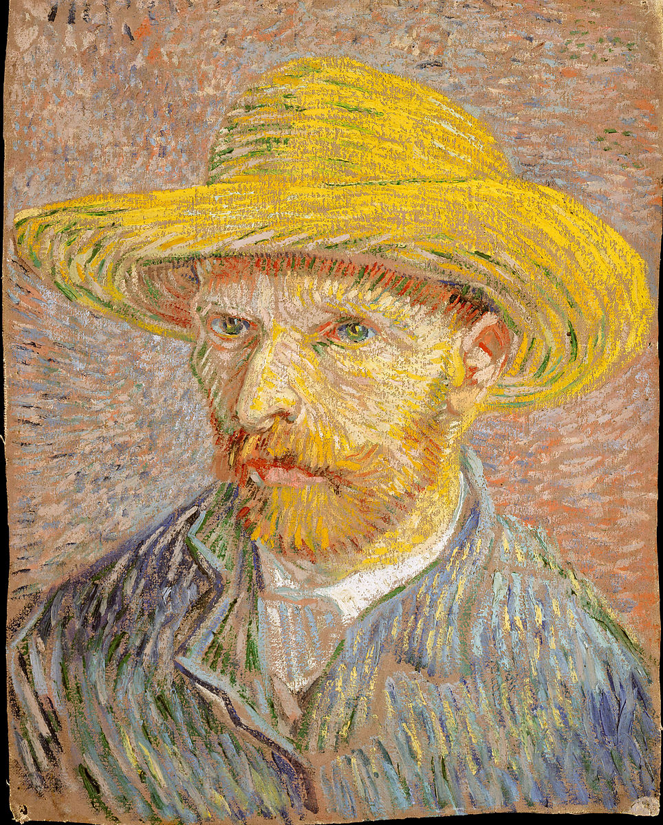
《Self-Portrait with a Straw Hat》Vincent van Gogh,1887,The Metropolitan Museum of Art
As many of you may know, Van Gogh's career as a painter was not long. First, he began his career not as a painter, but as a pastor. He worked as a coal miner with an interest in literature and religion, then continued his work as an evangelist even though he was suffering from poverty. After failing the jobs, he finally began his life as a painter.
The most striking thing about Van Gogh's works is his strong brushstrokes but the most important thing for him was the color expressions in the paintings. His painting ideology can be proved by his letters to his young brother which he wrote about choosing colors and how the colors mean to him emotionally.
In fact, he described the painting "Bedroom in Arles" in the letter, “This time it's just simply my bedroom, only here colour is to do everything, and, giving by its simplification a grander style to things, is to be suggestive here of rest or of sleep in general. (*1)”
What supported Van Gogh's colors were chrome yellows (developed in 1815) and cadmium yellows (developed in 1820). However, chrome yellows are mainly composed of lead chromate which is difficult to obtain today due to its toxic nature, so other colors are used as alternatives instead.
In other words, his passionate yellow colors are made of heavy metal-based paints which appeared after the Industrial Revolution and are now difficult to find.
In addition to his mastery of the "new paints," he was also passionate about the surfaces of paintings. The thick, opaque, gouache-like brushstrokes were created by mixing the above-mentioned colors with large volumes of silver white and zinc white.
Silver white is a warm white that dries quickly and has firm characteristics. It has the advantage of holding the upper layers well and its poor pigmentation makes it suitable as a middle layer or for mixing with other colors.
On the other hand, zinc white is a cool white suitable for color mixing.
Due to the nature of the pigment, this color cannot be used for the bottom layer because it will cause cracking and peeling of the top paint layer. In other words, he mixed these two types of white with a variety of colors to create a firm paint structure.
It is also said that Van Gogh developed the color theory of Delacroix, whom he respected, and made his method of making vibrant pictorial space based on the arrangement of colors.
Although Van Gogh's impressive style along with his dramatic biography tends to draw attention only to the emotional aspects of his work, his use of color and the composition of his paintings are the result of a combination of his intelligence and philosophy.

《Cypresses》Vincent van Gogh,1889,The Metropolitan Museum of Art
Here are some painting materials for those who would like to paint with colors like Van Gogh actually used.
If you want a color similar to this chrome yellow, we recommend a paint called "permanent yellow." Although the raw material is different from chrome yellow, the permanence is higher than chrome yellow as you can tell from its name.
PIGMENT TOKYO「Permanent Yellow」
Cadmium yellow is still available today and PIGMENT TOKYO offers a wide variety of cadmium yellow, from powder pigment to tube paints.
PIGMENT TOKYO「Cadmium Yellow」
Furthermore, we also offer silver white and zinc white.
Although it is not possible to obtain the exact same materials as those used in the past, it may be interesting to experience these materials to experience his paintings.
Citations
*1_Shuji Takashina, “Meiga Wo Miru Me 2” (Iwanami Shoten Publishers.1971) 54.
References
・ H. W. Janson, “History of Art, Volume 2, New Edition” Translated and Directed by Kiyoshi Murata, Hideo Nishisda (BIJUTSU SHUPPAN-SHA CO.,LTD.1990)
・Knut Nicolaus, ”The Restoration of Paintings” Directed by Mistuhiko Kuroe, Translated by Nobuko Kuroe, Hideyuki Ohara (BIJUTSU SHUPPAN-SHA CO.,LTD.1985)
・Kazuo Jo, Michiyo Hashimoto, “History of Paintings and Their Colors”(PIE International.2013)
・ HOLBEIN “Colors Anatomy ⑧ Whites in Oil Paints”
https://www.holbein.co.jp/blog/art/a183
(Viewed on December 25, 2023)
・The Nishinippon Shimbun, "[Reissue Serialization] Why do the paintings of Van Gogh's shine so brightly?”
https://www.nishinippon.co.jp/item/n/847961/
(viewed December 25, 2023)
Translated by Atsumi Okano and Nelson Hor Ee Herng
PIGMENT TOKYO Art Materials Experts

