

Last Updated on:November 7th, 2025
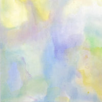
Harmonia is a series of transparent watercolors that produces beautiful and interesting shades with a simply wet brushstroke. Since anyone can easily create a grainy textured surface with it, Harmonia could be used for a wide range of purposes, including illustration and design, as well as fine art.
And now, in addition to the popular Harmonia 12-color set, new colors have joined the lineup!
Harmonia (Granulating Watercolor ) Plus
Single paint tubes are also available. Please check our complete color lineup here.
Generally, tube paints from major Japanese brands are formulated to keep a stable condition for a certain period. Therefore, even when multiple pigments are mixed to make a single paint color, their combination is unlikely to cause separation. While this is the norm, my question is why did the product development focus on color separation? For this article, I interviewed Tomotaka Iwasaki who has been in charge of Harmonia development at KUSAKABE CORPORATION, headquartered in Asaka City, Saitama Prefecture. This interview will reveal the secrets of Harmonia transparent watercolors which are named after the word "harmony."
ーCan you explain what inspired you to develop Harmonia?
Tomotaka Iwasaki (hereafter, Iwasaki/titles omitted): A while ago, there was a foreign manufacturer who produced paints with this kind of granulating color.
However, it might have caused complaints if this product showed up in Japan about 10 to 15 years ago.
Because of this reason, most Japanese manufacturers were not very motivated to develop this type of product, but we decided to give it a try.
As you can see, in the first 12 palettes we released, the colors were relatively earthy and subtle because we visualized them to be used mostly for fine art. We expected them to be painted as a background so the colors were not too vivid or too saturated.
Our original idea was to develop paints that could create nuance in daily life, for example, the atmosphere of the sky or the texture of a wall.

Tomotaka Iwasaki, Harmonia's development manager at KUSAKABE Co.
ーI heard that the amount of people who appreciate this series is far more than what you had expected.
Iwasaki: To be honest, I was quite surprised that even people who usually draw illustrations use our products *laughs*. Because we mainly focus on creating original oil paints which the main target is for fine artists, therefore, we rarely get to cross paths with illustrators.
So we’re very happy to hear that some customers started using KUSAKABE products for the first time because of the Harmonia series.
ーWhat kind of reactions or feedback have you received from illustrators?
Iwasaki: We received some feedback from customers who purchased the first set saying that they wanted brighter colors.
We started selling the first series in the spring of 2022 and we decided to increase the number of colors in the same year.
ーThat’s amazing!
Iwasaki: Right! That's how we decided to create the next set with brighter palettes. As a first attempt, we asked people on Twitter what kind of colors they wanted.
We received a variety of suggestions, such as bright reds, yellows and neutral colors, and you can find all these colors in this lineup.
ーWhen you’re making the tube paints, do you choose the pigments first or do you come up with the idea of the colors you want to make first?
Iwasaki: The first thing I did was visualize “the specific feeling” I wanted to create.
Otherwise, the thinking process would be endless. However, it could not be done by chance, so I also selected the colors with careful calculation.
The separation of these paints is occurring based on two properties which are granulating and staining. Since there are very few red or yellow pigments that have such properties, we struggled a little to develop these colors.
ーWhat are “granulating” and “staining”?
Iwasaki: “Granulation” or “to granulate” comes from English which means to form a grainy texture like sugar. While “staining” refers to that condition, like when a cloth has been dyed with tea etc.

How paint colors are checked at the factory. The colors are examined by human eyes to make sure there are no differences from the previous lot.
ーHow did you actually select pigments under such difficult circumstances?
Iwasaki: I was doing a lot of research and happened to come across a yellow pigment that was perfect for this concept. If not, I don’t think I would have expanded my ideas.
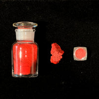
Unfortunately, the red colors did not turn out to be as strong and vibrant as I hoped for, but I found out that we could import Potter’s Pink which is popular overseas, and I knew I had to include this pigment in the formula.
However, this pink is rather challenging to mix with. Since Potter’s Pink is a very pale pink, if I mixed it with yellow, it would turn brown; if I mixed it with red, the pastel tone would disappear. It was really difficult to bring out the best part of this color.
ーDo you use the same pigments used in the KUSAKABE ARTISTS’ WATERCOLOURS?
Iwasaki: Some of the pigments are the same, but there are also some pigments we specifically used for this product. Nevertheless, the process and machinery used to make the paints are the same as other paints. We make adjustments to find color combinations that will separate no matter how many times kneaded through rollers. Some colors do not mix well with each other, but we do it intentionally.
ーI assume that this kind of knowledge is unique to a manufacturer that knows how to knead paints together thoroughly without separating them.
Iwasaki: The difference in specific gravity of each pigment has the most impact, but other factors are as important too, such as wettability and the way they blend with water. Moreover, we take each difference as an advantage and use it to separate them on purpose.
Harmonia uses gum arabic as the binder and this material is very poorly dispersible. That is why it separates beautifully.
For example, acrylic emulsions have good dispersibility, so they mix easily and have difficulty becoming paints like Harmonia.

Harmonia being kneaded at the factory. This color is Witch Bordeaux.


ーHow many colors have you experimented with to create the final palette in this 12-color set?
Iwasaki:We have created more than 100 color samples in total. There are pigments in this set that have never been used for paint material anywhere in the world.
For example, the Pigment Black 23 (PBk23), is a gray pigment rather than black. I mixed it with Indanthrene Blue (PB60).
Personally, I made it to resemble the night sky.
After the colors are finalized, the paints are filled into tubes like this.

After the colors are finalized, the paints are filled into tubes like this.
ーIs it most likely to mix 2 kinds of pigment?
Iwasaki: Although many of the paints are made by mixing 2 kinds of pigment, there are also paints mixed with 3 or 4 kinds of pigments. The color between yellow and orange is made by mixing 4 kinds of pigments.
ーIs there any particular base material or substrate you would recommend for use with Harmonia?
Iwasaki:I don't have any particular preference as long as it is on paper, although it depends on the quality of the paper and the size of the piece. Whether the sense of separation is strong or weak will depend on the user's preference and how they use it. However, if you want to utilize the granulating effect more, paper with a lot of pulp (fiber) or paper that is a little hard and sized would probably be the best choice.
ーDo you have a particular color you would like to produce in the future with Harmonia?
Iwasaki:We have produced colors with red spreading out but we have not been able to create granulation colors in which red comes together.
Due to various restrictions, we have not been able to find the right pigments to do so, but it would be nice if we could come across one someday!
Harmonia has become a popular product by matching with unexpected users. Deciding colors based on surveys through social media had not been done by any paint material manufacturers in the past, which added a charm to this product.
I recommend people to try Harmonia, a series of Artists’ Watercolour made with the knowledge and technology of a Japanese manufacturer.
KUSAKABE × PIGMENT TOKYO Special Workshop
KUSAKABE Presents: Discovering the World of Watercolors
A workshop hosted by KUSAKABE, a long-established paint manufacturer.
Participants will have the chance to explore a variety of unique paints, including limited-edition watercolors such as Shuffle Gray and Red Jasper, made with upcycled pigments, as well as Charcoal Black, which contains charcoal powder.
Participants will also have exclusive access to limited-edition items available for purchase on the day of the workshop.
*This event has ended.
Find the latest information about our workshops here.

[Special Workshop] KUSAKABE Presents: Discovering the World of Watercolors
Note:
Although this workshop will be delivered in Japanese, English and Chinese. If this sounds like working for you, you are welcome to join our workshops.
Date:August 21 (Thu), 2025
Time Slots: 11:00-11:30, 12:00-12:30, 14:00-14:30, 15:00-15:30, 16:00-16:30
Venue: PIGMENT TOKYO
Fee: JPY 1,650 per person (tax and materials included)
Recommended Age: High school age or above
Reservation/Details:
11:00–11:30 [Special Workshop] KUSAKABE Presents: Discovering the World of Watercolors - 11:00_ August. 21. 2025
12:00–12:30 [Special Workshop] KUSAKABE Presents: Discovering the World of Watercolors - 12:00_ August. 21. 2025
14:00–14:30 [Special Workshop] KUSAKABE Presents: Discovering the World of Watercolors - 14:00_ August. 21. 2025
15:00–15:30 [Special Workshop] KUSAKABE Presents: Discovering the World of Watercolors - 15:00_ August. 21. 2025
16:00–16:30[Special Workshop] KUSAKABE Presents: Discovering the World of Watercolors - 16:00_ August. 21. 2025
A selection of watercolor paints available for hands-on testing
- Limited edition watercolors made with upcycled pigments such as Shuffle Gray etc.
- Charcoal Black, made using powder from natural charcoal
- The Harmonia series, known for its distinctive and beautiful colors
- Single Pigment Watercolors that highlight the unique characteristics of each pigment
Exclusive Benefits for Workshop Participants
- [Special Sale]
Limited-edition watercolor paints made with upcycled pigments*
*Please note that items already sold out from the manufacturer will not be available at this event.
- [One-Day-Only Purchase Opportunity]
Individual colors from the Harmonia Watercolors and Single Pigment Watercolor series will be available for purchase exclusively on the day of the workshop.
Art Materials Expert at PIGMENT TOKYO
Akira Oya
Born in 1989 in Tokyo. Master of Fine Art and Design at Nihon University College of Art.
He also continues his career as a visual artist.
Born in 1989 in Tokyo. Master of Fine Art and Design at Nihon University College of Art.
He also continues his career as a visual artist.
Translator
Atsumi Okano
Completed her post-baccalaureate program at the School of the Art Institute of Chicago in Painting and Drawing.
While working with PIGMENT ARTICLES mainly as a translator, she also creates paintings and installations with translucent materials as an artist.
Favorite matière: Interaction of intentionality and coincidence created by the layers of transparent materials and colors.
Translator
Nelson Hor Ee Herng
Graduated with a BFA in Japanese painting from Tama Art University. Using paintings, embroideries and installations to document issues related to our modern society.
Favorite material: Mineral pigments used by ancient people to paint murals.
Graduated with a BFA in Japanese painting from Tama Art University. Using paintings, embroideries and installations to document issues related to our modern society.
Favorite material: Mineral pigments used by ancient people to paint murals.